What is Web Brutalism?
This site started as a personal study to understand what Web Brutalism actually is, or at least try to. It’s surprisingly hard to define, with a lot of different takes on what counts. I built this to explore those perspectives and figure out my own.
01.
Brutalism
If you already know the bare-bones of Brutalism (yes, that’s a brutalist joke), feel free to skip. For the rest, here’s a quick overview of its origins.
As usual, it started with the French. Brutalism is named after the term “béton brut”, meaning raw concrete. Brutalism is built on the idea of showcasing materials in their natural state: concrete left rough, wood with its grain unapologetically visible. It was all about honesty in construction, what you see is what you get.
Architectural historian Reyner Banham outlined three principles of Brutalism:
Memorability as an Image: Also know as "Formal legibility of plan", a building’s design should leave a strong visual impression. Every element serves a clear purpose, making the structure immediately understandable.
Clear Exhibition of Structure: A building’s framework should be visible, not hidden. Structural elements should be part of the design rather than concealed or decorated.
Valuation of Materials “As Found”: Materials should be used in their natural state. Concrete remains rough, wood retains its grain, and surfaces are left unpolished.
Post-World War II, this style emerged as a response to the need for efficient, functional buildings. Architects like Alison and Peter Smithson were pivotal in developing and defining Brutalism, describing New Brutalism as "an ethic, not an aesthetic," aiming to create buildings that were functional, honest, and reflective of their purpose, inhabitants, and location.
This overview provides a concise introduction to Brutalism, its style and its philosophy. I think it’s important to understand Brutalism’s roots in architecture to better understand its digital counterpart. If you want to know more about the movement, additional sources written by more competent people are listed at the end of this article. Notably, Amanda Harvey and Thomas Bey William Bailey provide insightful introductions to the topic.
02.
Web Brutalism
Here, I’ll try my best to break down what Web Brutalism is, where it came from, and why some people seem to hate it.
A common misconception is that Web Brutalism is about making ugly websites. This isn’t (always) the case. Instead, I believe it’s about stripping away unnecessary embellishments to emphasize content and functionality — focusing on simplicity and directness. Sometimes, when I open a designer’s website, I don’t want to wait 10 seconds for it to load, then sit through a 3-second animation each time I click a project, struggle with a custom scroll, and ultimately have no idea where I am.
Web Brutalism, much like its architectural counterpart, values raw presentation and functional clarity. It pushes back against overdesigned, polished interfaces in favor of something that feels bare, maybe even unfinished. Like architectural Brutalism shows concrete as concrete, Web Brutalism keeps the default styles, raw HTML structure, and very little else.
This design approach produces websites that look straight out of the early 90s. Barebones HTML, blue links, monospace text, black and white color palettes. The kind of design that looks accidental — but very much on purpose.
Examples and Case Studies
I think the best way to understand is by looking at examples.
1. Craigslist
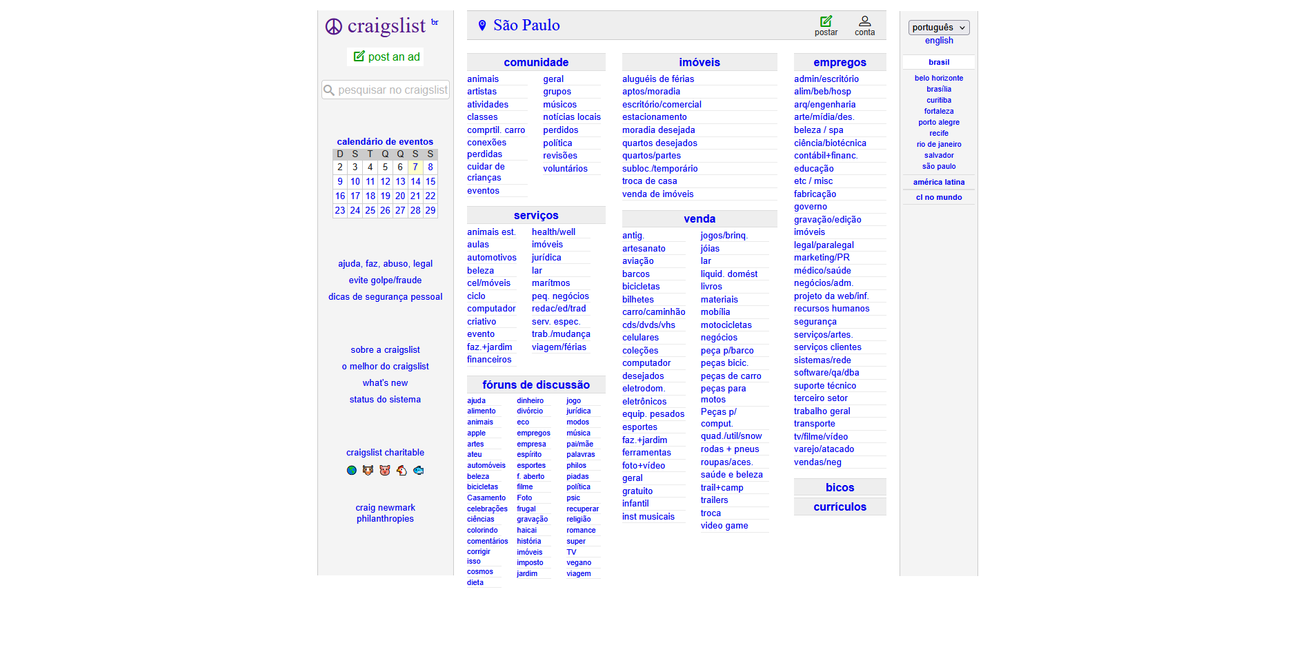
Craigslist is one of the clearest examples of a site driven entirely by function. It’s fast, minimal and hasn’t changed much since the 90s. Back then, this wasn’t a design decision, just what was possible. But today, I think leaving it that way is a deliberate choice that aligns with brutalist values.
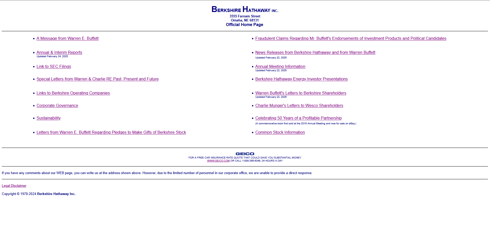
Another famous case is Berkshire Hathaway’s website. This one goes even further. The entire site is blue text on a white background. No layout tricks, no graphics. Just links separated by horizontal lines. And that’s it. Textbook minimalism.
There are a bunch of other examples. Sites like Drudge Report, Hacker News, Balenciaga and some featured in BrutalWeb, are good references that deliberately embrace a look that recalls the web’s early days.
Visual Presentation
Looking at the examples, we can see a few common features:
Basic Typography: System fonts like Times New Roman, Arial, or Courier New, often left unmodified, typically in black or blue.
Clear Layouts: A clear and simple layout that follow the principle of "form follows function", you can easily recognize it’s elements, placements and visual hierarchy.
Unstyled HTML Elements: Forms, buttons, links, mostly untouched from the browser’s default style.
Comparing early web pages to modern brutalist sites reveals an intentional embrace of web design’s raw foundations. If it looks simple or like it was written in Notepad, that’s usually the point. The aesthetic is a choice.
Antidesign
There’s often some confusion between Web Brutalism and Antidesign. They get thrown into the same bucket, but they’re different.
Antidesign emerged in the 60s and 70s as a reaction against modernism and the idea of "good taste" in design. Instead of clarity and utility, Antidesign pushed for chaos, provocation, and raw expression. It didn’t care much about usability — it wanted to break things, confuse people, and make you feel something.
Some of the key characteristics of Antidesign:
Asymmetry: Rejecting balanced layouts in favor of irregular, unstable and tense compositions.
Overlapping Elements: Images and text frequently overlap, leading to a chaotic and dense visual experience.
Disregard for Structure: Ignores conventional grid systems and visual hierarchy.
Clashing Colors: Bold and contrasting color palettes are used to overwhelm and draw attention.
Mismatched Typography: Combining various fonts without concern for consistency or readability.
So while both Brutalism and Antidesign reject conventional design, they do it differently. Antidesign leans into chaos and excess, often prioritizing emotional impact over readability. Brutalism strips design down to its core, prioritizing clarity and directness.
Neo-Brutalism
Neo-Brutalism builds upon the raw and unpolished principles of Web Brutalism but refines them into a more structured and functional aesthetic. It’s less about looking like Craigslist and more about taking the brutalist spirit and merging it with modern UI/UX sensibilities.
Neo-Brutalist websites usually feature:
Bold Typography: Still flat and direct, but intentionally chosen. Often large, sans-serif, and very visible, designed to create hierarchy through weight and spacing rather than embellishment.
Grid Layouts: Clean structure, often with strong vertical or horizontal divisions.
Flat, High-Contrast Colors: Color use is intentional. It’s not trying to be subtle or soft — it’s meant to be seen. These colors are often loud and they serve a purpose: to communicate clearly, to separate areas, or to emphasize hierarchy.
Minimal Effects: Animations are rare and usually very simple — fades, transitions, maybe a hover state. Nothing flashy. The interaction is secondary to the static composition.
The use of color is probably the easiest way to spot Neo-Brutalism. Where Web Brutalism tends to rely on grayscale palettes or minimal color use, Neo-Brutalism embraces sharp contrasts, bold backgrounds, and high-saturation hues. Color here is functional and also expressive. It adds personality without falling into ornament for ornament’s sake.
I believe there’s an argument to be made that it isn’t brutalist anymore, that it’s too designed. But I think that’s part of the conversation. Neo-Brutalism still rejects polish for polish’s sake. It just does so while being slightly more intentional about visual impact.
This is more simple than correct, but I usually define Neo-Brutalism as Web Brutalism but cartoonish. It’s easier to understand, full of color, and honestly, kids would probably like it (just a joke about "new = bad").
03.
Contemporary Discussion
While exploring Web Brutalism, I started questioning how practical it really is for my own work, as someone who mostly builds websites and mobile apps.
As we discussed before, Architectural Brutalism emerged from a need for efficiency, durability, and cost-effectiveness. Raw materials, no decoration, no pretending.
But today, when I build a website, I use tools like Tailwind CSS, Shadcn UI, and even MUI. All of these tools are efficient and help speed up development, but they come with a lot of opinions baked in. So the question becomes: can something still be called brutalist if it relies on heavily styled, opinionated frameworks?
Web Brutalism often refers to a specific aesthetic characterized by minimalist design, plain typography, no decoration. But if we think in terms of architectural Brutalism, where the structure is exposed and honest, then maybe the brutalist web equivalent is exposing the actual technology. But that’s hard to do when the tech stack is layered with abstractions.
In this project, I knowingly overdid it. A simple static page about Brutalism was (hypocritically?) built with Astro, React, Tailwind CSS, Shadcn UI, and TypeScript. Yes, I used a JavaScript library, a component system, a CSS framework, and a styling library that abstracts Tailwind further. Not exactly "raw HTML". Definitely not minimal tooling.
I even changed the default styles of those tools to make the site feel more brutalist, I swapped in a monospace font, adjusted background and text colors away from the original black and white, added a light/dark mode, and used spacing and padding instead of explicit borders to define layout sections. I stylized the links a little but tried to keep the visual system straightforward. I didn’t stick to defaults, but I didn’t try to hide the structure either.
So, can this project be considered brutalist?
Honestly, I don’t know. No one really knows. I am by no means a capable enough designer, architect or historian to actually define and judge what is or isn’t brutalist (I know I kinda did this before but we already established my hypocrisy), but I think it’s important to bring this discussion to the table.
Just like architectural Brutalism started fading as new materials and new priorities came in, maybe Web Brutalism is also getting squeezed out by new workflows and cleaner tools. It’s not just about utility anymore, people expect good UX, accessibility, mobile responsiveness. And those things are easier to achieve using prebuilt systems, which tend to hide the "rawness".
But in the end, this is just a discussion about Web Brutalism and the pedantic attempt to define what is and isn’t it. I believe that Web Brutalism and what it inspired is not just about utilitarianism, it’s about expression. It’s about a movement and an aesthetic that people connect with, they like it, they find value in it, it sparks interest, or it evokes some type of emotion.
When someone consciously decides to do a brutalist piece of work, whether it’s a website, a mobile app, or a building, it’s not necessarily about following a strict set of rules some random person is trying to define online. It’s about intention. It’s about expression.
Even if that something is just: "I didn’t want to wait for your loading screen."
04.
This Project
This is where I try to explain where this project came from and how it was made.
I work mainly as a frontend developer, focusing on web and mobile development using the React ecosystem. I have a background in design — but I’m more a developer than a designer. Still, I’ve always been drawn to design, architecture and the broader category of “art stuff,” and I’m always trying to learn more when I can. I first came across Brutalism back in school and kept circling back to it over the years. Recently, I started thinking more seriously about Web Brutalism and ended up in the middle of a surprisingly interesting conversation. This project came out of that, it’s part personal study, part way to share what I found.
Tools
I touched on this earlier, but in case you skipped it: this website was built using Astro, Tailwind CSS, Shadcn UI, TypeScript and React.
I picked those tools for two reasons: first, because I’m comfortable with them (React, TS, Shadcn), and second, because I wanted to get more familiar with the others (Astro and Tailwind 4.0). It’s a mix of what I like and what I wanted to try out.
Now, could I have gone more "brutalist" with the tech stack? Sure. I could’ve done it in plain HTML and CSS, no framework, no styling libraries, no build step. That would’ve been an interesting technical and creative challenge. But it also would’ve been a different project. I was more interested in the content and the conversation than in proving a point through the implementation.
Still, I think it’s a valid direction for someone else to take. If you do that (or already did) feel free to reach out and share it. I’d love to see what you come up with.
Berkshire Hathaway (Almost) Redesign
One extra thing I considered while working on this project was doing a quick redesign of the Berkshire Hathaway website. It’s probably the best example of Web Brutalism I’ve seen. I thought it would be interesting to explore how a few minimal changes could make it more convenient by today’s standards without losing its essence. I didn’t end up building it (yet?), but I genuinely think it’s a great example of good design.
05.
Sources
A list of sources I used for this project
This is a personal study, not a scientific article. Some sources are not academic or professional, but they provide useful material for discussion and help form your own opinion. Since this is not a formal research paper, I haven’t followed certain academic conventions, such as citing every (almost all, to be fair) source directly in the text.
Here’s the list:
Articles & Discussions
The list below has the main content I used to write this article and form an opinion. These articles are great and I recommend you check them out.
"Brutalist Web Design: Where Did It Come From and Why Is It Back?" by Suzanne Scacca
"Brutalism and Antidesign" by Kate Moran
"I browsed through 100+ brutalist websites; here’s what I learned" by bogdanelcs and other users
"The Split Personality Of Brutalist Web Development" by Frederick O’Brien
"Brutalist Web Design, Minimalist Web Design, and the Future of Web UX" by Pascal Potvin
Aharvey Creates - Brutalism by Amanda Harvey
Brutalist architecture by Wikipedia (Yes, Wikipedia •ᴗ•)
"Concrete buildings: Brutalist beauty" by Christopher Beanland
"Brutalism Is Back" by Michael Snyder
"The New Brutalism" by Reyner Banham
"New New Brutalism: The Architecture of Troubled Times, Then and Now" by Thomas Bey William Bailey
Case Studies & Example Websites
Some of these are directly mentioned or used as examples in the article.
Berkshire Hathaway (Their legal disclaimer says not to link to their website without permission — and big corporations are scary, so I’ll pass)
Visual & Design Inspirations
This websites were used as visual inspirations for this website. Some of these are arguably not Web Brutalism, and some are just ones I liked while doing the research.
Hard to Classify
These items don’t necessarily follow what I believe it’s Web Brutalism, in some cases it’s more neo-brutalism, antidesign or just hard to fit in a specific category. But I think they are still good material to discuss and I invite you to see the websites and points they make to form your own opinion. This is by no means a form to disrespect, discredit or diminish the work and effort of the people involved in the following items (I even used them myself for this project).